

The logo is a 300 pixels, 2x3 inches (600x900 pixels)logo.
The two typefaces used are:
Arial Round MT Bold font, which is clearly applied in the preview of the logo with the branch location (on the left) plus the class of programe being viewed (on the right).
Brush Script My font, which is applied in the major part of the logo, that is where the full meaning of the NTA acronym is written below the logo.
The colour scheme I chose, is similar to those of the existing logo and this is to avoid creating something totally different from what the brand is known for. This could deal a major vote to the station as to the possibility of losing its identity totally, both in shape and colours.
The colours were chosen so as to create a relationship between the old and the new logos.
The colours include a deeply shaded brown colour which could represent the earth and applies to the station in terms of how down to earth it is in getting and disseminating it's news.
The green and white relates to both life and the country the station servers with special respect to the colour of the flag.
Also having them on both sides of the logo creates a visual balance while putting the logo in the center of attraction.
The red strip represents a base on which the station stands and operate, not just being based on unanchored facts.
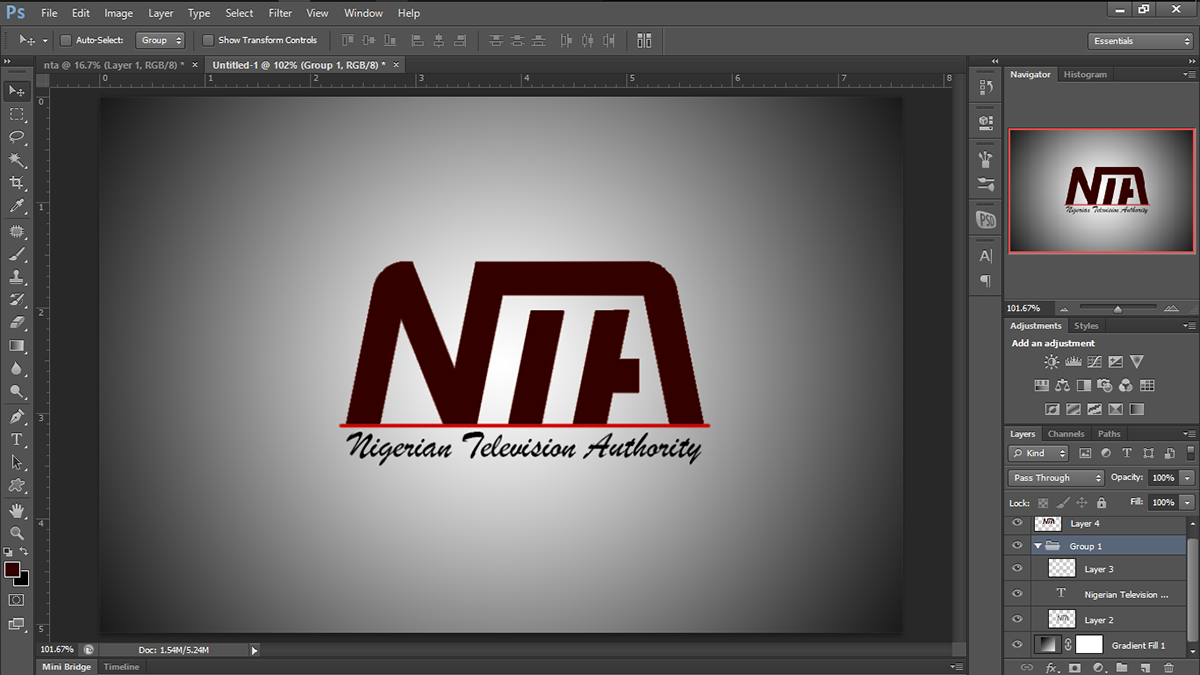
The wavy font below creates a fun effects which would apply to the youths to pull their attention to the fun programe being provided for such age grade and at such, putting every age into consideration.

On the logo are two hidden facts:
The hidden 'm', under the 't' and 'a' which stand for 'media' of which the station is all about.
The little triangle which stands for an arrow head pointing upwards which signifies an upward growth. And this is growing from a base already created, represented by the red strip.
The hidden 'm', under the 't' and 'a' which stand for 'media' of which the station is all about.
The little triangle which stands for an arrow head pointing upwards which signifies an upward growth. And this is growing from a base already created, represented by the red strip.

Lastly, the two beveled edges on top of the logo, which make for a friendly look and not a sharp dangerous look.

The design was also made to be flexible in color, so that it could be printed on any surface with any color without losing its shape, and at such easily identified. This comes in handy in cases of the branding of some office or other objects.

Anthony Chinweuba
Town Planner, Brand Strategist and Identity designer,
Logo Designer, Graphic Designer.
Founder/CEO Tobedesigns
… Least details, Most Impacts …
Connect with ANTHONY CHINWEUBA on
Connect with TOBEDESIGNS on
Calls and Whatsapp


